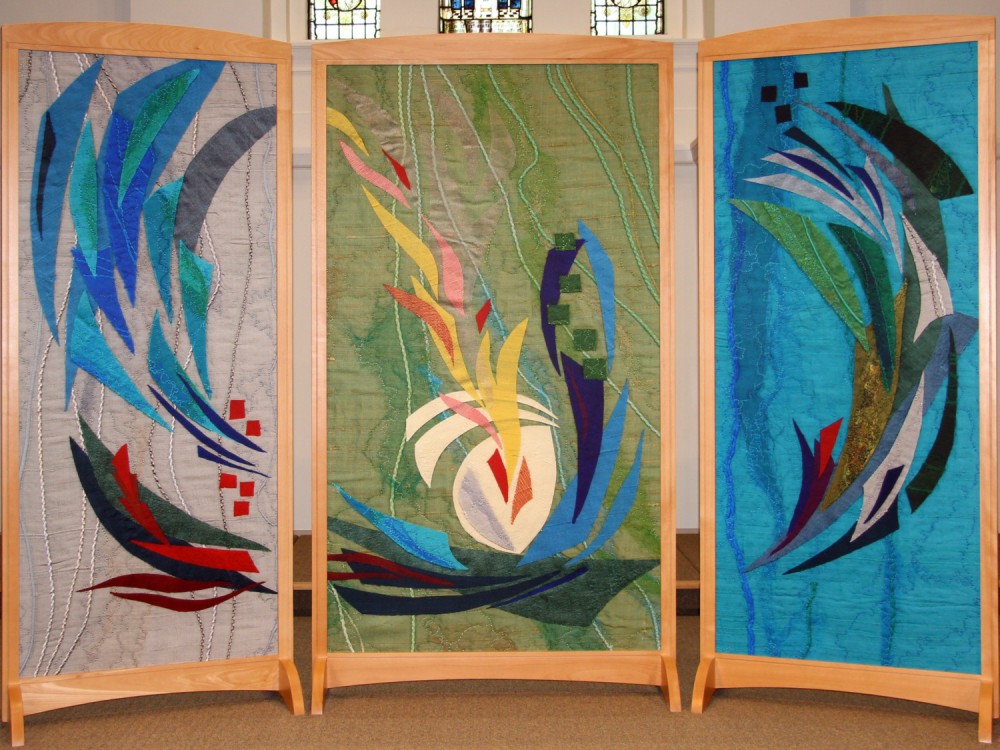
Our previous Minister Revd Brian Jolly wrote an article for our church magazine ‘Vision’ in the February/March 2015 issue:
Since September when our new worship area was first celebrated and dedicated many worshippers - members of this church and lots of visitors - have delighted in the splendid artwork designed for our new furniture by Polly Meynell. And it was pleasing for those who were able to share in the Service of Celebration and Dedication in September to hear Polly speak and to meet with her after the service.
What do the beautiful abstract designs that Polly has provided for us say to us?
There is no definitive answer to this question because the designs will speak in different ways at different times to different people. Having said that, we do know what was in Polly’s mind as she prepared the designs, and her thoughts give us one of many interpretations.
As we will see, the designs are associated with the seasons, moods and movements of the Christian year and the colours which often represent them: purple is used for times of preparation and penance - Advent and Lent; white and gold are used for celebration and rejoicing - Christmas, Epiphany and Easter; green is used for times of re-commitment and growth; and red is used at times when we remember the work of God’s Spirit and, sometimes to represent the suffering of Jesus.
These are Polly’s thoughts about the triptych:
The abstract shapes have an overall theme of coming together; of community within the church.
The colours on the left are balanced by the use of similar colours in reverse on the opposite side giving a sense of wholeness and completing a circle.
The body of Jesus is represented by shapes in white in the central panel, and his suffering by red squares and shards.
The purple of Advent and Lent shield the body of Jesus in the centre and begin the growth into the green of ordinary time on the left side.
Rising plumes of gold in the centre symbolise the resurrection and ascension of Christ.
A variation on this interpretation sees the main circle representing the world, with the Christ and his church playing a central part within it as the Christian way to God.
Some have seen the diversity of colours representing the diversity of God’s creation; others have associated the whole design with the fire of God’s Spirit.
The four panels in the communion table and font have been taken from the triptych, and they represent the four seasonal themes with their associated colours, as explained above.
The panel in the lectern has an ‘all season’ theme.
Please do take time on various occasions to explore and reflect upon these lovely designs, and allow God to speak to you through them. And please share your ideas with others. Certainly I will be pleased to hear from you about how this special art is a blessing to you.
